|
Painting is a fine balance between spontaneity and control. To spontaneously allow a watercolor wash to mingle on the paper, or leave a composition unbalanced, or create a playfully random contour line is always a gamble. Many seasoned artists learn to create perimeters in which randomness can wander, while staying within the confines of their final vision. For many of us, however, spontaneity is a difficult quality to harness. It often works against us rather than for us, and it’s easier to just do without it altogether. I struggle with insecurity when it comes to taking risks during the painting process, but constantly admire the work of those who do. Here are some examples. 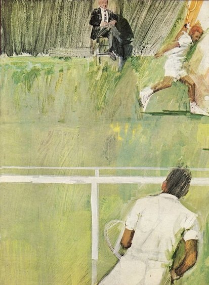 "Tennis Players" by Bernie Fuchs I love this composition by Bernie Fuchs, a 20th century commercial illustrator. Both tennis players are nearly tangent to the edge of the painting, and your eye would fall off the page if it weren’t for the strong horizontal lines repeated across the surface. This painting is energetic and captivating for the very reason that it teeters on the edge of control. 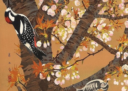 "Cherry, Greater-spotted and Pygmy Woodpecker" by Rakusan Tsuchiya Here’s a composition by Rakusan Tsuchiya using a similar method with the focal points riding the edges of the composition. Having to search for the subject becomes engaging. 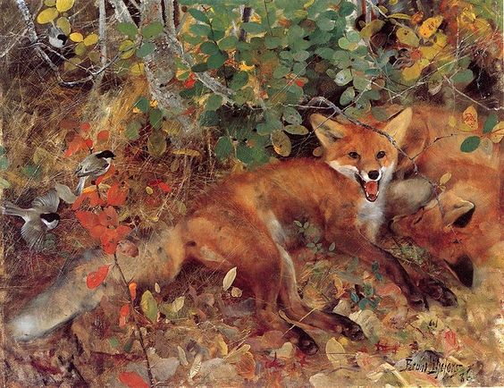 "Foxes" by Bruno Liljefors Bruno Liljefors was famous for his charming and random compositions that mimic the spontaneity of nature so well. 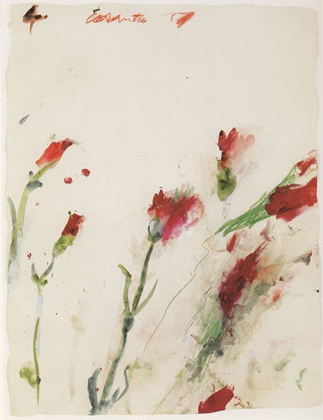 "Untitled No. 4" by Cy Twombly Along with compositional design, creating spontaneity in mark-making is another skill that creates energy in a painting. This is one reason why children’s work is often so charming. They haven't learned control, making their art fresh and unexpected. Many veteran artists are the opposite. They’ve mastered control and then attempt to override their mechanical programming in order to create unexpected strokes. Cy Twombly built a career on this concept. 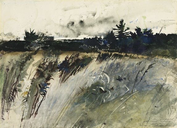 "Waldoboro Woods" by Andrew Wyeth This watercolor painting by Andrew Wyeth perfectly portrays the randomness found in a child’s painting combined with the obvious control of a seasoned artist. He knew how to harness spontaneity and make it work for him--from the stabs of watercolor paint that suggest the clouds in the sky, to the random spots of pure blue and yellow scattered throughout the painting, to all of the combined marks that form a grassy field without mechanically repeating vertical lines. It's the willingness to take risks that gives his work such visual impact.
3 Comments
One of the questions I’m most often asked is what I use for references in my paintings. I always begin a painting by gathering many different references from various sources—some from my own collection of photos and field sketches, and some from the collections of other willing photographers. Often, I’ll study similar species that might share physical characteristics, behavior, or environment in order to gather additional information and inspiration. Then, I draw a series of small thumbnail sketches without using any references in order to create an original composition that has roots in my own imagination and experience. After a basic design is reached, I piece together possible photos and field sketches that will help me construct what I envision. I take the head of one bird, the eyes of another, the posture of another, the coloring of yet another, etc., in order to devise a “Franken-bird” of my own creation. Eventually my franken-bird begins to come to life with a finished line drawing.: 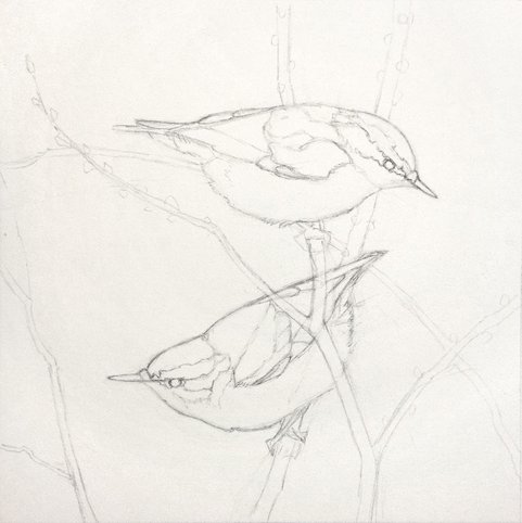 I begin the watercolor process with light washes of local color that I can build on. Since it's easier to dull a color with successive layers than it is to make it brighter, I lean towards a higher saturation for these initial washes. 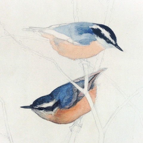 With this particular painting I experimented with a dry brush technique. Color and value were built up slowly using small amounts of dry pigment in the brush. You can see some of the finished result on the bird below. I began with a bright wash of cyan on the back and head. Then I dry-brushed darker blue over the top, allowing the cyan to peek through. The technique creates color variation in the final result. It's important not to dry-brush straight over the white of the paper or else the final color will be dull and anemic. 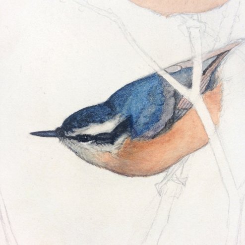 I continued to use this same technique until the two birds were complete. 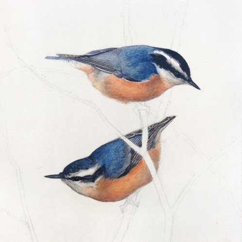 Finally I added the branches and feet and stepped back to see what else would be required to finish the composition. 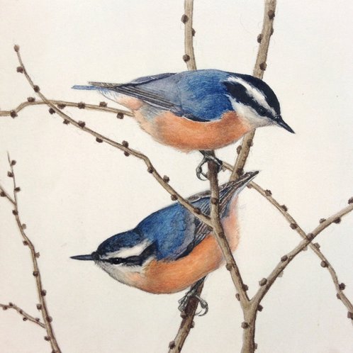 I decided a few transparent branches in the background would create one more level of depth and not take away from the simplicity of the final design. 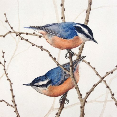 "Red-breasted Nuthatches" -5"x5"- Watercolor on Arches hot press paper These nuthatches are one of six small paintings (a series of winter birds) that will be shipped in March to the Nahcotta Gallery in New Hampshire for a small works show.
Inspired by some of my favorite bird artists of all time (Louis Agassiz Fuertes, Edwin Penny, Eric Ennion, etc.) I’ve decided to give gouache a try this year. Gouache is one of those nemesis mediums I’ve attempted to use multiple times in the past and every attempt ended in embarrassment. Here is a painting from my college days that was an assignment for a media experimentation class. We were told to render a red spherical object in light and shadow using gouache. Naturally I chose a cardinal. 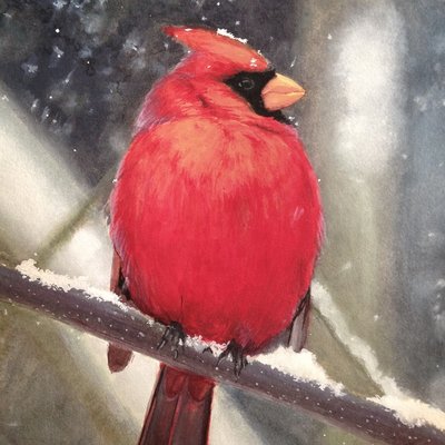 Hopefully this painting illustrates not only how far I’ve come in rendering birds, but also the struggle I faced with the medium at the time. With transparent watercolor, highly saturated, light-valued colors are created by allowing the white of the paper to show through. No white pigment is required. With gouache however, you add white pigment just as you would in any other opaque medium such as oil and acrylic. The trouble is that white pigment in gouache kills the saturation more than it does using any other medium. Every hue goes chalky, cool, and dull, like the colors found in a pack of Neccos.  You can see how the orange Necco looks just like the orange in the highlights of my cardinal. I know there is a solution to the problem, because other artists have mastered it. James Gurney and Nathan Fowkes are two of today’s artists who excel in the medium.
Yesterday I decided to try a small study of a Blue-fronted Amazon Parrot, being the first bird I’ve painted entirely in gouache since my disappointing cardinal.  "Blue-fronted Amazon"- 7"x7"- Gouache While I still can’t seem to create the same intricacies in value and temperature shifts that are possible in watercolor, I was happy with the progress I made. Just as it takes years to master a language in order to say exactly what you want, I suppose it takes years to master a new medium. I’m invested in learning how to work gouache into my regular painting process, and hopefully you’ll see more from me soon. As 2017 begins I’m inspired by a book I received as a Christmas gift, “The Singular Beauty of Birds”, about the life and work of Louis Agassiz Fuertes. Born in 1874, Fuertes was one of the leading ornithologists and bird artists of his day. He remains a favorite of mine and many others who follow in his footsteps. His paintings strike a balance between scientific accuracy and true artistry, a feat I find challenging as one who appreciates the scientific study of birds but who also has a background in fine art. 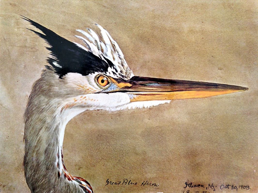 "Great Blue Heron" by Louis Agassiz Fuertes 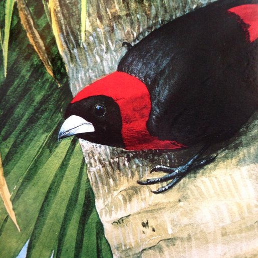 "Crimson-collared Tanager" by Louis Agassiz Fuertes At 17 Fuertes was inducted into the American Ornithologists’ Union (AOU) as the youngest associate member ever. In the following years he traveled as an illustrator on many expeditions alongside scientists and researchers to the Bahamas, Jamaica, Alaska, Mexico and Ethiopia. 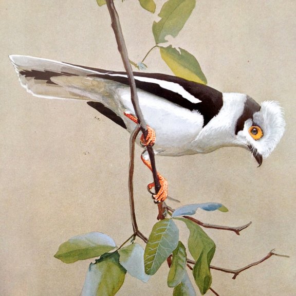 "Curly-crested Helmet Shrike" by Louis Agassiz Fuertes Fuertes had a close relationship with the artist Abbott Handerson Thayer, who is most well known for his stunning paintings of angels. Thayer was also a scientific thinker and formulated a controversial theory on counter-shading camouflage among animals (You can find an interesting article here). Thayer’s wildlife portraits usually depicted this fascination with animal camouflage in a dramatic way: 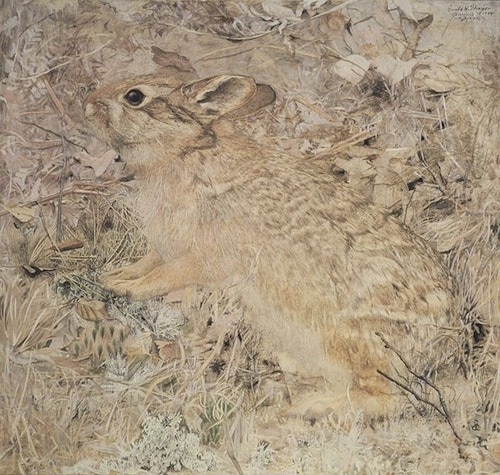 "The Cottontail Rabbit among Dry Grasses and Leaves" by Abbott Handerson Thayer It’s said that Fuertes was occasionally reprimanded by his friend for having his birds stand out too much from their environment. On the other hand, his employers were often returning his work and instructing him to make the birds stand out even more. 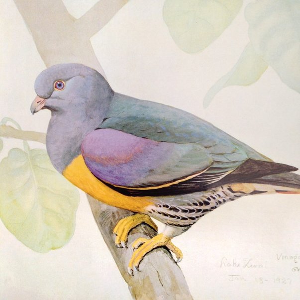 "Bruce's Green Pigeon" by Louis Agassiz Fuertes While I appreciate the skill required in a finished and fully rendered painting, sketches and unfinished work are often my favorite. A sketch is where mastery can most readily be seen. Maintaining accuracy and finesse while working speedily testifies of an artists’s skill. Fuertes displayed that finesse in his sketches, depicting his birds expertly while maintaining a freshness to the watercolor medium. 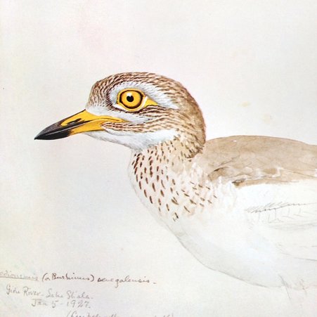 "Stone Curlew" by Louis Agassiz Fuertes “The Singular Beauty of Birds” is now out of print, but I would recommend picking up a used copy wherever you can find it. Louis Agassiz Fuertes has given us a standard to aspire to, and this book is as good as a college course for any bird artist.
|
 RSS Feed