|
I was recently profiled on a curatorial art website called The Krakens. Here is a link to an interview where I discuss my art a little further. Feel free to take a look! 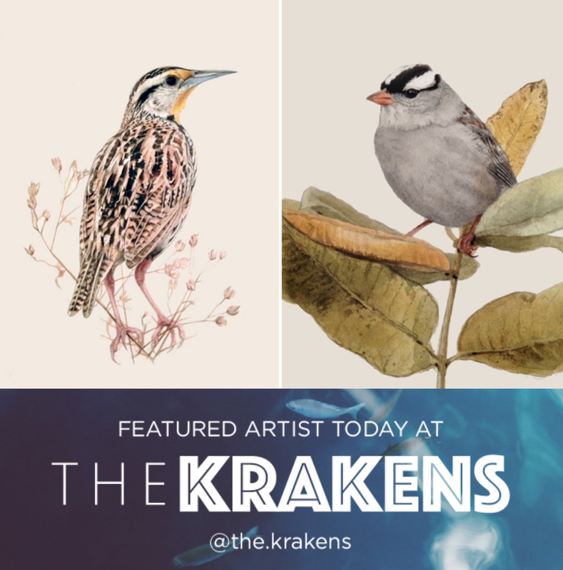
5 Comments
A painting in its beginning stages can be a little awkward (I like to call it "the gawky teenager stage"). Some paintings mature and progress into something worth showing, and some don't. I have a recurring fear that someone will walk in on the beginning phases of a painting, take one look, and say "Oh.................... that's nice." On the other hand, being an artist is seeing the potential in something, even your own paintings. Here are four of my paintings that made it through their gawky teenager phase: 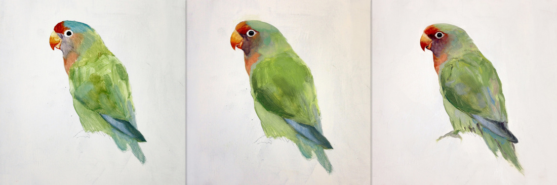 "Lovebird" 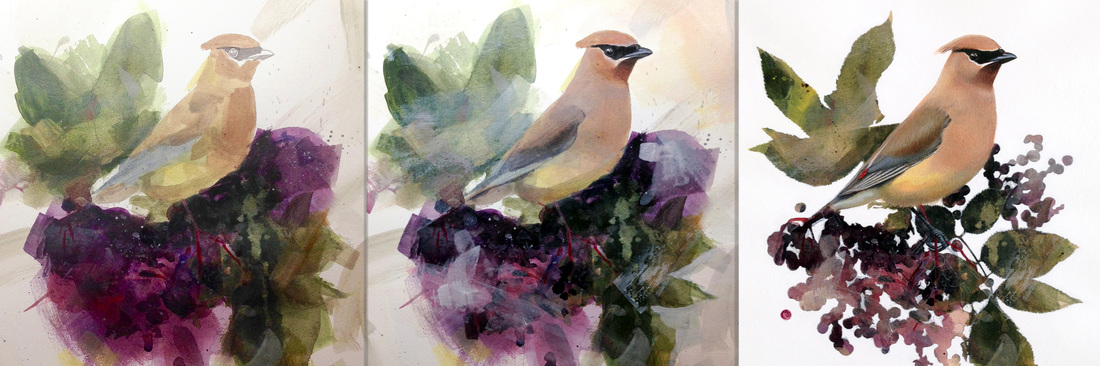 "Cedar Waxwing and Elderberries" 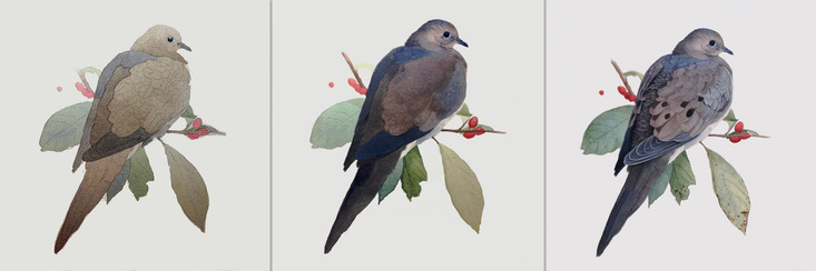 "Mourning Dove and Spicebush" 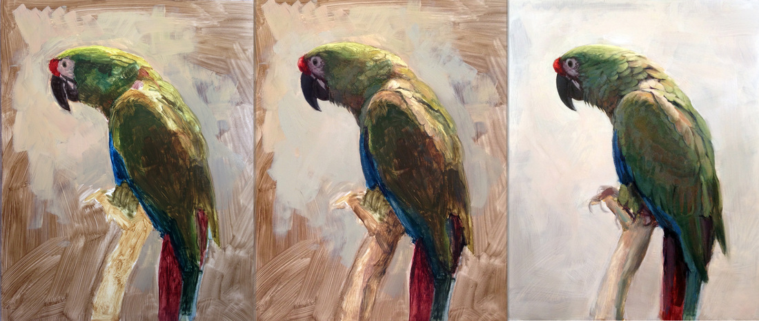 "Buffon's Macaw" In spite of being an avid birder and painter most of my life, it was only six months ago that I decided to combine the two and paint birds exclusively. The learning process continues, not only to depict them accurately, but to capture the un-tangible loveliness that drew me to the subject in the first place. This Little Blue Heron was a battle. For days I worked on tuning the colors just right--blue verses red, gray verses vibrant. If I can hit the color notes I’m looking for while attaining a sparkle of detail in the head of a bird, then I consider a painting a success. Here's a sampling of my battle: 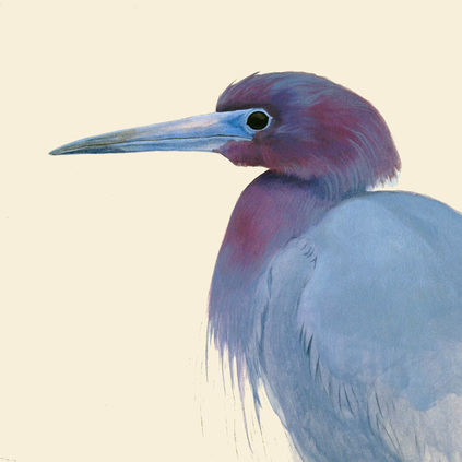 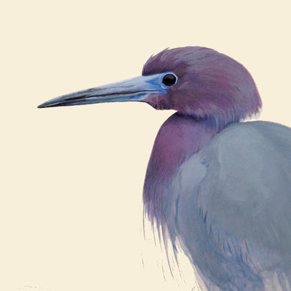 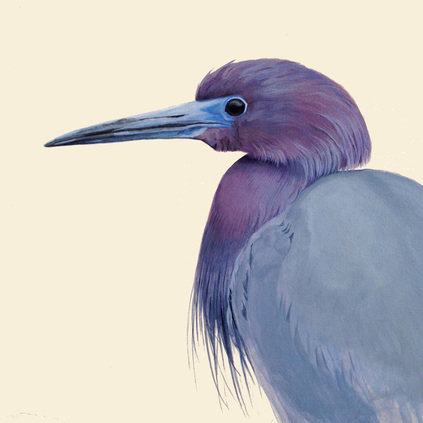 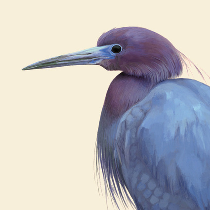 It always gets worse before it gets better, and every successive "wrong" layer can create variety and depth in the final product.
When I was young and an obsessive birder in training I traveled to a fishing lake not far from home. On the bank of the lake was a female Wood Duck with an injured wing. Up to that point I had only observed this shy species from a distance, and when I witnessed the surprising variety of colors on this close-range specimen I was fooled into thinking it was some exotic rare species that I couldn't identify in my field guide. Remembering that experience I wanted to create a painting that would introduce others to the true character of this "brown duck". They may be surprised to discover that this seemingly modest lady sports a brazen yellow eyeliner. 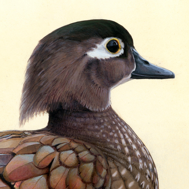 When the purpose of a painting is all about celebrating colors, it may seem counterproductive to choose a limited palette and nearly monochromatic color scheme. But doing so allowed what colors there were in the feathers to remain the highlight. I also chose to portray the duck from a sideways angle. In avoiding a direct pose I hoped to universalize the subject matter and make it into something to be “observed”.  So there she is, the female Wood Duck as I see her. Every bit as lovely in her own way as her strikingly-patterned male counterpart.
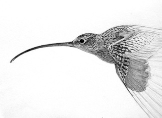
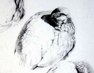
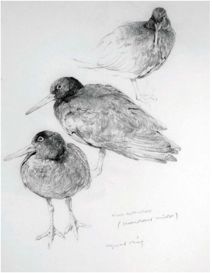 When I was in college I heard a specific adjective used again and again to describe my work: Mushy. Webster’s definition: “Soft and pulpy”. In other words, I used six or seven sketchy lines when one was enough, I oversimplified my contours, my values were messy, etc. I was thinking on my paper instead of in my head. Since then, I’ve been on a quest to “sharpen” my drawing skills. One of the biggest inspirations in accomplishing my goal has been the work of Ray Harris-Ching, New Zealand bird artist. Here are a few of his sketches: 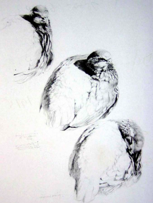 He is a master at capturing minute detail without sacrificing the overall values of the form. I struggle to capture these basic values (highlight, halftone, core-shadow, etc.) when they’re hidden beneath a web of feather patterns. So I practice. Yesterday I sketched a curlew, beginning with the contours: 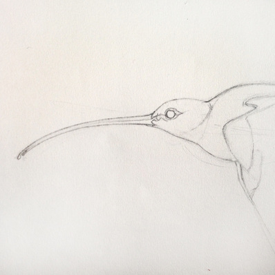 Already my drawing looks over-simplified when compared to Ray Ching's sketches. To finish I drew in the intricate feather pattern, shaded the form, and darkened any details that fell into shadow (in that order). Here’s my final sketch: 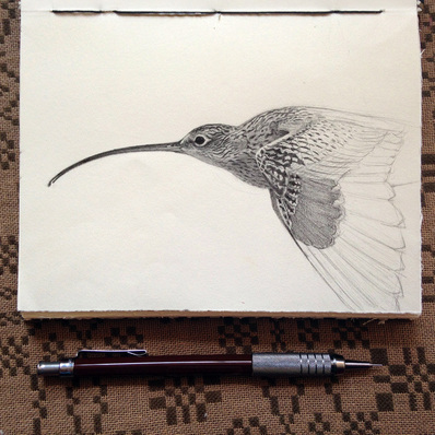 And now here's a side-by-side of mine (turned black and white) and one of Raymond Ching's so you can compare the level of detail:
His ability to capture minute shifts in contours and value contrast wins against mine hands down. You can only draw as well as you can see, so I'll keep working on seeing that hyper-detail. Until next time!
A few weeks ago I spotted a deep purple bottle of nail polish. The color struck me as something lovely, and I filed it away in my brain for future processing. Days later when I was brainstorming what to paint next, I pulled that deep purple color out of my mental filing cabinet and pulled the lever on my mental slot machine: Spinning, spinning, spinning… purple elderberries… spinning, spinning… a yellow Cedar Waxwing belly… spinning, spinning… waxy green leaves… ding, ding, ding! It’s a match! And that’s how a painting is born. One color leads to another color, leads to subject matter, leads to a painting. In this case, a Cedar Waxwing. But first, let me show you how incredibly unattractive a painting can look in its beginning stages: 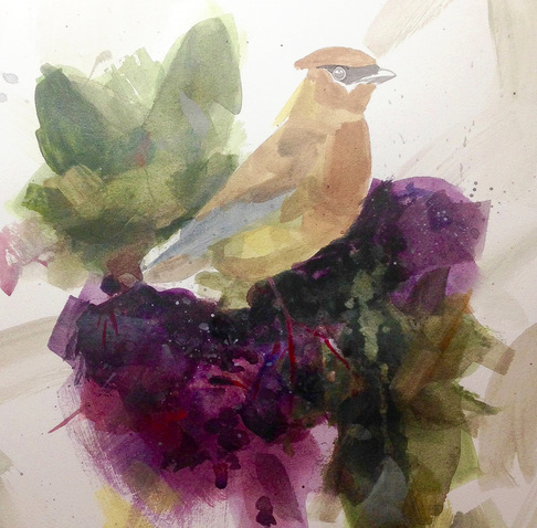 This is the stage where someone invariably comes to visit, views your newest work in progress, and leaves with a very low opinion of your painting skills. I'm only showing this stage because I know this story ends happy. I wanted the colors and patterns inside the berries and leaves to be abstract, so I started with a loose and abstract under painting. That’s what you see above. Once I was happy with the variety in the under painting, I began to carve out the shapes of the berries and leaves with a toned white paint: 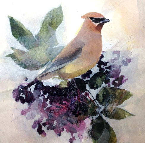 Many, many layers later, and after a more rendered approach to the bird itself, I have my final product: 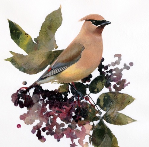 "Cedar Waxwing and Elderberries" Acrylic on Lanaquarelle hot press paper.
Here is the final outcome of my Elf Owl painting: 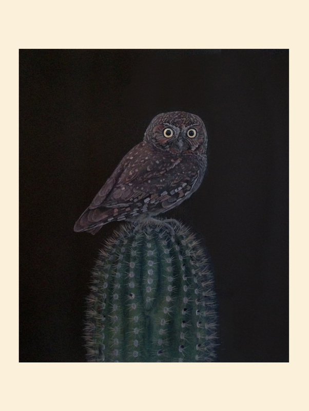 And a side-by-side with the natural history print that inspired it:
I'm happy to have given the black background a try, but it was more of a challenge than I expected. I don't think I'll be giving it another go any time soon! Thanks for following along with this one!
Due to other pressing art matters I’ve only been able to work on this guy on and off for the past week. It was nice to get back to him today. Here’s a progress shot of where I ended the last time I had a chance to paint: 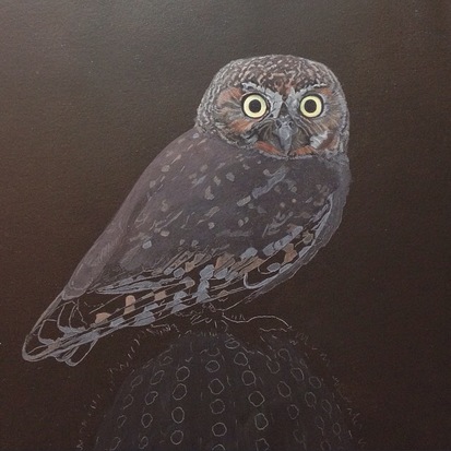 In order to render the feathers on the head and back, I paint the shapes and details a few shades lighter than they should be. Then I take a thin wash of brown paint and glaze over the top of everything. You can see the results of this first layer on the owl’s back in the picture above. Once the glaze is dry, I rework the light spots, add mid-tone details, and then the darkest accents. After repeating the whole process a few times, and reworking it again and again, I start to get something like this: 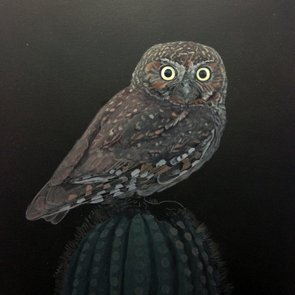 This is where I left off today. I still have more work to do on the owl, and then it's on to the cactus. After the painting is completely finished, I'll glaze over the eyes in order to lower their value and decrease their impact. I'm leaving that for the very end so I can make the decision in the context of the entire composition. Next time I post, you'll see the final product!
Here are the first faint washes on my Elf Owl painting, which kinda looks like one of Toulouse Lautrec's Moulin Rouge posters at the moment (I think it's the colors): 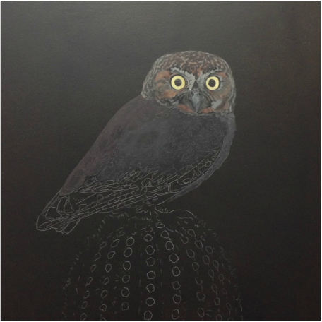 Painting on black is tricky. To help with the process I created a black palette that would facilitate accurate color mixing, but a gray palette may have been a better choice since I find myself constantly mixing my colors a few shades too dark. 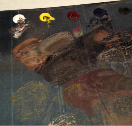 For this painting I want to avoid a strong atmospheric effect in order to keep it natural history-esque, which is why I'll be mixing warmer colors than what you'd normally see in a moonlit scene. I'll continue to post progress shots as the painting continues!
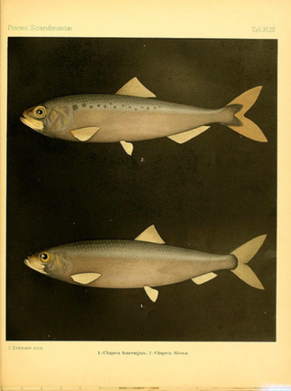
A few years ago I worked at a wilderness program for at-risk youth in Arizona’s Tonto National Forest. At night I used to sit by the campfire after everyone had gone to bed and listen to little barking noises in the trees above me made by Elf Owls that were drawn in by the firelight. Those experiences were the inspiration for my next painting of an Elf Owl, along with this natural history print I found on the Biodiversity Heritage Library’s Flickr stream: 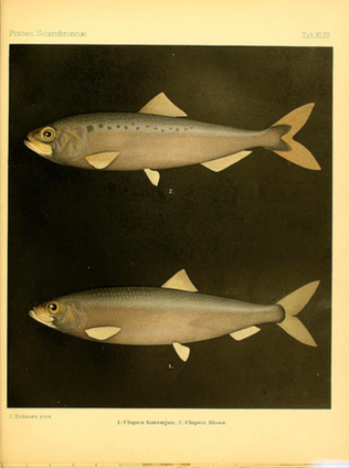 I love the black square of India Ink framing the fish, representing the darkness of the deep-sea environment where this species can be found. I wanted to use the same technique for my Elf Owl. Here's the quick thumbnail sketch for my final composition (Nothing too fancy): 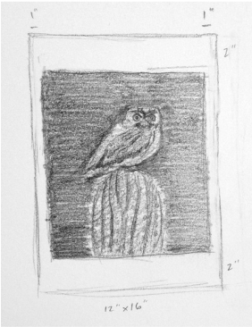 Over the coming days I'll be posting progress pictures so you can see how it comes together!
|


 RSS Feed